Has Your Website Reached Its Full Money-Making Potential?

Your website isn’t a brochure. It’s not meant to just look nice and be informative. Its purpose, first and foremost, is to sell.
Sell. Sell. Sell. And then sell some more.
If your website isn’t directly generating leads and contributing to the growth of your business, then it hasn’t reached its full potential.
Luckily, the internet makes it easy to adjust. In fact, if you’re not constantly testing and fine-tuning your website – if you’re website isn’t “optimized” – you’re losing money.
Look, there’s always something you can do to make your website more striking, more impactful and more effective. But until you know what that “something” is, you’re just feeling around in the dark.
To help you discover what weaknesses (if any) your website has, I’ve compiled 7 straightforward questions you, as a business owner, should periodically ask yourself.
Can you answer all 7 with a resounding “YES!”?
WindowWorks, one of Spectrum’s clients in the home improvement space, can...
Let’s use them as a benchmark to add some context to the following questions:
Does Your Website Engage Visitors?
In other words, after visitors arrive on your site, does it draw them in with crisp, beautiful visuals and then present them with a clear, compelling call-to-action (i.e., a next step that will drive them down your sales funnel)?
As you can see, WindowWorks homepage does this very well:
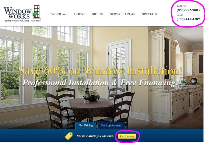
The first thing visitors see when they land on the page is a large, commanding image, which showcases the elegant craftsmanship WindowWorks is known for. Circled in pink are the page’s calls-to-action – “Get Pricing” takes you to an online quote form while the other captures phones leads.
Go to the page itself and you’ll find a Spectrum Managed Chat box just off to the right. Scroll down and you’ll see more opportunities to “Set an Appointment” or to “Read Customer Reviews” – all put in place as part of the mechanism that drives leads down the funnel.
Is Your Website Easy to Navigate?
Many visitors will land on your website with a specific product or service already in mind. The last thing you want to do is confuse or frustrate them by not providing a clear path to more information about that specific product or service.
WindowWorks leaves no chance for such an opportunity:

Circled in pink is the site’s “main navigation” bar. It’s like home base for visitors. It quickly helps them find exactly what they’re looking for, which is incredibly important – particularly online (where the average attention span is less than 4 seconds).
Does Your Website Have Fresh Content?
The easiest way to consistently add new content to your site is with a blog, which is a win-win: great for search engines and great for humans.
Google and Bing love websites with blogs because every post provides new content to craw, index and rank.
People love blogs because they provide valuable information that can ultimately help them make a buying decision.
Does Your Website Offer Incentives?
Incentives have helped sell people since the beginning of time – and they’ll work on visitors to your website, too.
Shoppers love a good deal. That’s why WindowWorks puts there promotional offers front and center:

If your business provides a commodity product or service like WindowWorks does, the secret to selling your customers is 1) giving them a good feeling about you and 2) giving them a deal.
Is Your Website’s Branding Consistent?
Branding matters.
Your business – regardless of its size – will benefit from a logo, tagline, or specific color pattern that reminds people that your company is trusted and reliable.
That’s why you’ll see this artwork on every single page of the WindowWorks website:

Drive the point home and then drive it home some more. That’s how you get people to remember you.
Does Your Website Link to Your Business’s Social Properties?
WindowWorks keeps their social icons really low key. See how they just blend into the website’s footer:

How much attention you draw towards your social properties all really depends on how much attention you want them to receive in the first place – if you have the resources to devote to social media, then you’ll probably want a lot of traffic.
However, if you’ve put your Facebook, Twitter and LinkedIn profiles on the backburner for now, you might want to hold off sending your visitors there until you can deliver value.
Is Your Website Mobile?
www.MyWindowWorks.com looks and functions optimally on any device. In other words, browsing the WindowWorks website is easy and intuitive whether you’re on a phone, a tablet or a laptop.
Spectrum built the site using Responsive Web Design (RWD), a technology that automatically reformats the website to fit any-size screen. This allows visitors to experience everything we just covered – effective engagement, easy navigation, tempting incentives, consistent branding, etc. – anywhere, anytime.
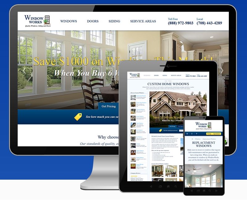
Google says that “52% of users said that a bad mobile experience made them less likely to engage with a company.” Expect this number to grow as more and more people become accustomed to intuitive, stress-free mobile browsing.
Spectrum can show you how to turn your website into a powerful marketing tool. Contact us to learn more about how we can help!

