This is What Websites Will Look Like in 2014

Hello, Business Owner.
I’m a Responsive Website. I’m what the future looks like. And the future is closer than you think...
Before you sign off, hear me out. Because when it comes to your website, switching to responsive design will bring your company the most value, the most usefulness – both now and in the long-term.
A well-made responsive website looks impeccable and functions flawlessly on any Internet-ready device. So whether your prospect is using a desktop, tablet or smartphone to view your site, they’ll be able to find precisely what they’re looking for (no matter where they are in your sales funnel) in a minimal number of clicks.
This level of ease has become the standard among mobile consumers. That’s why in 2014, getting a responsive website should be your primary online marketing goal.
According to Google, 74% of mobile users say that when they visit a mobile-friendly site, they’re more likely to return to that site in the future. Moreover, 67% say that when they visit a mobile-friendly site, they’re more likely to buy that company's product or service.
So what makes me, a Responsive Site, mobile-friendly?
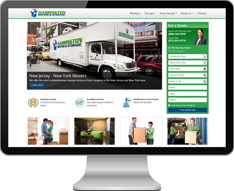 =
= 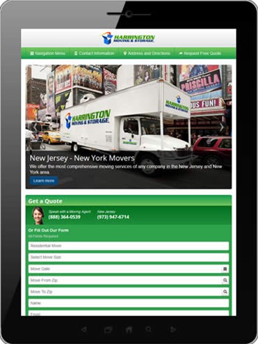 =
= 
Speed: I load in 5 seconds or less across any platform (online -- especially on mobile -- every second counts).
Usability: My buttons are big and vibrant, so they’re easy to find and press. You also won’t find anyone zooming me in or out.
Appearance: By proportionately transferring images and videos across all platforms, I give visitors a consistent branding experience.
Convenience: I prominently display business contact information and social media links. I’m also enabled with “click-to-call” functionality.
These are the features consumers are looking for when they access a website from a smartphone or tablet. And, as a Responsive Website, I’m equipped with all of them.
A word of caution:
Don’t have a responsive website just for the sake of having a responsive website.
In other words, it’s imperative that the backend (code) and the front-end (design + content) of a responsive website is created correctly. Popular website-building platforms like WordPress, which are template-based, offer business owners a fast and cheap alternative to a quality responsive build-out.
Sure, it’s a quick-fix. But as the saying goes, you get what you pay for.
Unlike a template, a responsive site built from the ground-up will not break when it stacks (i.e., I’ll look symmetrical and proportionally aligned 100% of the time). A professionally built version of myself will also have significant SEO advantages over anything WordPress can provide for you. Having the freedom to properly dictate where your H1s, H2s, titles and images go will make a world of difference. Placing quote forms and other lead generation tools in the optimal position will also boost your conversion rates (see below).
No hiccups = No compromised credibility. And remember:
“Quality is free, provided it is done right the first time.”
Bruce McIntyre, Founder MacPac Wilderness Equipment
A note from the editor:
Responsive web design isn’t a fad.
It’s the most time-efficient and cost-effective way to optimize your website for the consumers of 2014 and beyond. And Spectrum has the numbers to prove it:
We compiled data from 5 moving clients in responsive design and compared their results to the same periods last year. On average, these clients have spent 6 months in responsive.
We found that after they’d made the switch to responsive, the average mover had:
- 23% more leads come through the pipeline
- 11% more unique visitors to their website
- 3X more online leads come from a smartphone
Our search engineers also saw the average revenue-per-visitor increase by $18. For a moving website that attracts 1000 visitors per month, that’s an annual sales increase of $216,000.


