How Plain Ol' Jelly Helped a Remodeling Company Increase Its Leads by 309%

So here’s what happened at a gourmet grocery store about 15 years ago:
Researchers from Stanford and Columbia University set up a display of high-quality jams for customers to sample. Customers were also incentivized to buy a jar with a $1-off coupon. Half the customers were shown a display with 24 varieties of jam while the other half were shown only 6 types of jam.
Here’s what they found:
· The display stand with 24 types of jam attracted more people than the one with 6 jams.
· On average, people tried the same number of jams regardless of the offerings (6 or 24).
· Only 3% of people presented with the 24-jar display table made a purchase.
· A whopping 30% of people presented with the 6-jar display table made a purchase.
Based on the fact that presenting people with a third of the total selection yielded ten times the sales, we can conclude that:
1. People are less likely to make a decision when presented with too many options.
2. People will be more confident in their final selection if it’s chosen from a smaller pool.
3. People may appreciate variety, but too much will create looming doubt.
Basically, the main takeaway is this:
Too many options stress the hell out of people.
In other words, choice can be demotivating and can lead to something called decision paralysis, which is really bad for business.
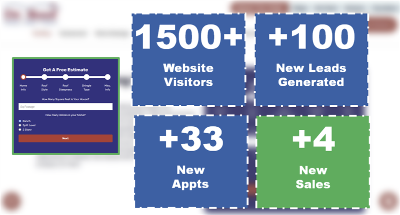
If you want your customers to take action – especially on your website – you’re going to have to simplify things (e.g., fewer buttons, fewer words, more space). That’s how Spectrum increased lead acquisition for WindowWorks, a Chicago-based remodeling company, by over 300%!
WindowWorks was founded by two brothers after years of working with and learning from their dad, a master carpenter. Our goal at Spectrum was to make their website as beautiful and functional as the remodeling projects they carried out for their customers. Our goal was to bring in tons of high-quality leads.
And we did.
Simplification, however, wasn’t our only strategy. Here are six other initiatives that helped WindowWorks increase their visitors, phone calls, and of course, sales.
1. Life cycle lead tracking
The online sales funnel (for services) looks something like this:
Customer Need > Search Engine > Website > Quote Request > Appointment Request > Sale
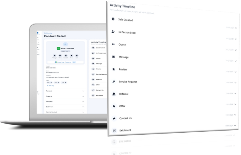
Spectrum helped WindowWorks implement a lead management system that their salespeople now use to better track this sales process. It’s also used to automatically send out “thank you” emails (which will increase your closing rates).
A lead management system helps companies understand which elements of their marketing campaign are working.
For example, WindowWorks uses it to ascertain where their prospects are coming from (e.g., paid search, organic search, email marketing, social media). Having this knowledge helps them allocate resources where they’re most effective.
2. Online appointment setting
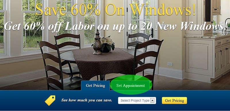
Successful marketers know that shortening the sales process is one of the best ways to increase conversions. By allowing their visitors to schedule appointments (rather than mere quote requests), WindowWorks did just that.
For remodeling companies (or any other in-home service provider, for that matter) an appointment is a huge opportunity, as it’s typically the last step before a sale. It’s also an option that attracts serious, quality prospects that are ready to buy, not price shop.
Ultimately, online appointment setting is a win-win: Customers can quickly request your services and your business gets consistently great leads.
3. Gorgeous images
Your website should draw people in with visual appeal, too.
Captivate your visitors by instantly capturing their attention with polished, beautiful images. WindowWorks builds credibility and trust by featuring high-quality pictures of work they’ve done on their homepage as well as service-specific galleries throughout the rest of the site.
4. Responsive Web Design
On average, Spectrum clients increase their traffic by 30% when switching to responsive.
And Google has said it over and over again: “We recommend using responsive web design because it has many good aspects.”
Responsive web design isn't hype. It’s the future. It will allow your customers to view your website at home, on the train, in a tree – wherever – because it will automatically adjust to the screen it’s being viewed on.
Companies with responsive websites reel in more leads because there is not one device in the world their website doesn't look great/function well on. Therefore, prospects will no longer be pigeonholed to requesting quotes/appointments exclusively on their desktop or laptop. They'll be able to do it on their iPhone while they wait at the doctor's office.
Want to experience this technology for yourself? Just click here and start adjusting the screen size.
5. Ceaseless sales support
...otherwise known as live chat, an efficient and cost-effective way to be there for your prospects all the time. On the WindowWorks website, you can find this service in the bottom right-hand corner of every page:
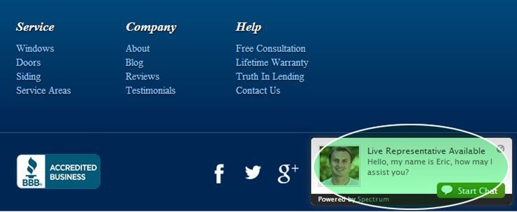
After only 31 days of implementing live chat on its website, WindowWorks saw a 45% increase in online lead volume and a 59% increase in online conversions.
6. A/B testing
Testing the copy and design of your web pages is essential to improving their effectiveness (i.e., testing is the only way to ensure you're doing everything you can to maximize conversions). The simplest way to do this is with an A/B test.
A/B testing can be done with software that allows you to temporarily change elements of your website to see if they have any impact on your conversion rates (e.g., changing the color of a call-to-action button).
Just like the jam experiment, there’s a control group (A) and a variable group (B). If your changes positively impact conversions (e.g., if the button’s color change spiked your quote requests) then it’s time to permanently implement the change. And if not, then it’s time to try something else.
So let’s bring all of this full-circle:
WindowWorks originally started with 11 custom windows pages:
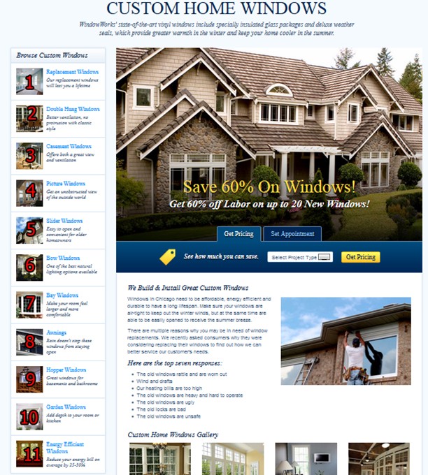
Considering what the jam experiment taught us about choice, we cut it down to 7 custom window pages:
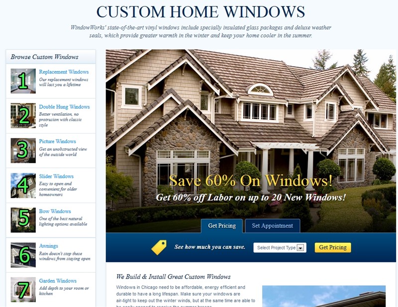
We ran this A/B test for a month and then checked the results:
WindowWorks’ online conversion rate quadrupled. This ascent in activity piled hundreds of extra leads into the sales funnel, which resulted in hundreds-of-thousands of extra revenue dollars per year.
Not bad. Not bad at all.
As you can see...
Internet marketing is as much a study in human psychology as the jelly experiment was all those years ago. Our technology might’ve changed, but our brains are still hardwired the same way:
Put too much in front of us and we might cry. Narrow our choices and we’ll give you a straight answer.
WindowWorks put this strategy (and others) to work and came out three times farther along than where it started. Consider implementing the aforementioned strategies on your own website and see what kind of results you get.
Already doing it? Share your story in the comments below!
Need help doing it? Contact Spectrum HERE for a free demo and consultation!


