How to Captivate Your Website Visitors in 2 Seconds Flat
The estimated time to read this article is 5 minutes

Are online leads important to your business? Then allow me to articulate one of your biggest fears:
It happens every day…
Your search engine marketing has worked: a qualified prospect has arrived at the homepage of your website. Your efforts have paid off. The endless content creation, the exhaustive keyword research, the tedious link building -- it's all been worth it.
A few moments go by and then, without notice, your qualified prospect -- the one you worked so hard to put yourself in front of -- hits the "back" button on her browser and continues to peruse the search engine results page. It's over. She's gone. Her business is soon-to-be elsewhere and it all happened so damn fast it hurts.
The good news is that your prospect's abrupt exit probably has nothing to do with your product or service. You know what you're doing and you do it well. Instead, when visitors leave your site prematurely, it's most likely an aesthetical issue, i.e., the design of your website and the images you use.
The reality of the situation is that your website is one of a billion -- literally, a billion -- and you only have a few seconds to captivate your visitors before they remember this fact and move on.
How to fix this problem:
Make your website a pleasure to look at.
A homepage that makes good use of sharp, high-quality images will instantly grip visitors -- capturing their attention and giving your company the credibility it needs to stimulate engagement (e.g., quote requests, service inquiry calls, newsletter sign-ups).
That being said, there's a right way and a wrong way to choose the images on your site.
What not to do:
Stop exclusively using stock photography. A diverse group of people standing in front of a white wall is meaningless. So is a plain handshake. It conveys no information. It carries no emotional message. Ultimately, it's a placeholder and if you use it too much, your website will start to look generic.

This stock image articulates nothing, fails to grab your attention, and is borderline creepy.
Opt for something better.
Use powerful images that hone in on elements people are naturally drawn to. Consider the style, composition and color of the photographs you use. Doing so will have a profound impact on consumers – influencing everything from the way they interact with your website to how much they trust your company.

Use striking, powerful photography throughout your website. Facial close-ups are especially captivating as the human face is typically the first thing our eyes gravitate to.

How a picture is put together – the placement and arrangement of each of its parts – can make a big impact on the viewer.

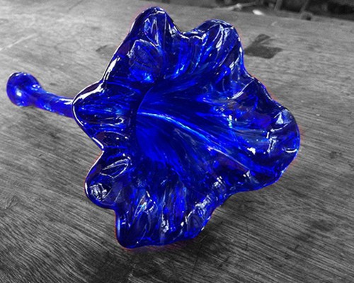
Color, especially when used creatively, can have a significant impact on the look and feel of a website.
You can also immediately captivate your website visitors with creative illustrations or images that have been cropped and integrated into the background of your website. This creates a clean, unified look that relays professionalism and credibility as well as a bit of personality and character.
Which brings me to my point: don’t be afraid to create a unique identity for your company.
Sure you’ve established your brand. You’ve made your company recognizable with a distinct logo and color scheme. Now sculpt your professional identity and company culture using creative, colorful, captivating photography that's as intriguing as it is effective.
That’s how you’ll keep people from clicking the “back” button.
For more information on how to optimize your website’s photography, call or e-mail your SEO – we’d love to hear from you!
Not a Spectrum client? That’s okay! Contact us HERE for some more valuable info!


